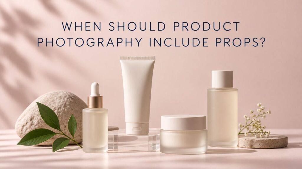
Product photography should include props when they help a shopper understand the product, reinforce a truthful brand story, provide scale, or create a useful visual hierarchy. Props should not be added simply to make an image look busy or “creative.” If an object competes with the package, hides an important feature, or suggests an ingredient or benefit the brand cannot support, the image is usually stronger without it.
For beauty, skincare, cosmetics, wellness, and lifestyle brands, the best prop decisions start with the job of the image. A clean product-page image and a launch campaign image may feature the same bottle, but they serve different decisions and therefore need different styling.
What Is a Prop in Product Photography?
A prop is any supporting object used to add context, structure, scale, color, texture, or narrative around the product. Common examples include blocks, trays, fabric, mirrors, glass, stones, plants, water, applicators, ingredient cues, and everyday objects. Background surfaces can also behave like props when their texture or shape becomes part of the concept.
The product remains the subject. A prop earns its place only when it makes the subject clearer or the intended message more specific.
When Do Props Improve a Product Photo?
When they explain scale or use
A hand, vanity tray, travel pouch, bathroom shelf, or familiar object can show how large a package is and where it belongs. Scale cues are especially helpful when dimensions are difficult to judge from an isolated pack shot.
When they organize a group
Risers, blocks, or trays can separate several products, keep labels visible, and establish a clear hero. This is useful for routines, gift sets, shade collections, and product families. The arrangement should remain understandable at mobile size.
When they support an approved story
A relevant botanical element, raw material, or texture can reinforce an ingredient or sensory story after the brand confirms that relationship. The prop should not imply unsupported sourcing, formulation, sustainability, or performance claims.
When they create channel-ready negative space
A simple shape or surface can guide the eye while leaving room for campaign copy. Planning the final crops before the shoot prevents important details from being lost when an image is adapted for a website banner, paid ad, email, or vertical social placement.
When Should Product Photography Avoid Props?
Props are usually unnecessary in primary marketplace images, many comparison views, packaging documentation, and other contexts where the product must be isolated and immediately legible. Review the rules for each destination before production. Our guide to choosing a product photography background explains how a controlled surface can add visual interest without turning the frame into a complex set.
Remove a prop if it causes any of these problems:
- It covers the label, closure, applicator, or product texture.
- It attracts attention before the product does.
- It makes the product appear larger, smaller, or different than it is.
- It suggests an ingredient, use, or benefit that has not been approved.
- It creates reflections, color casts, or shadows that reduce clarity.
- It makes the composition difficult to crop for required channels.
- It dates the image quickly without serving a campaign need.
How Many Props Should a Product Photo Use?
There is no fixed number. Use the fewest elements required to complete the idea. A single riser may create hierarchy. One ingredient cue may communicate the concept more clearly than a scattered collection. A more elaborate editorial scene can work when every element contributes to a planned story and the product remains dominant.
A useful test is to remove props one at a time. If the message becomes clearer and nothing meaningful is lost, leave that object out. Restraint is often what makes a styled image feel deliberate rather than generic.
How Should Beauty and Skincare Brands Choose Props?
Begin with the packaging shape, finish, color, formula, audience, and approved brand language. Frosted glass may benefit from a darker edge or translucent surface. Glossy cosmetic packaging may need large diffusion panels and carefully positioned cards. Creams, oils, and serums can be paired with real product texture when the formula can be handled accurately.
Props can serve several distinct goals:
- Clinical: clear acrylic, measured lines, glass, clean tiles, and precise spacing.
- Botanical: restrained natural materials that relate to confirmed ingredients.
- Luxury: sculptural forms, controlled reflections, rich surfaces, and generous negative space.
- Playful: color blocking, graphic shapes, repetition, and unexpected scale.
- Everyday use: believable bathroom, vanity, desk, travel, or bedside context.
These are starting points, not formulas. The final direction should be recognizable as the brand rather than an imitation of a visual trend.
Do Props Belong in E-Commerce Photography?
Sometimes, but not in every image. A product page usually needs a clear primary image, multiple product angles, packaging details, texture or applicator views, and scale or in-use context where helpful. Styled images can then add atmosphere and explain how the item fits into a routine.
Use the e-commerce product photo checklist to separate essential information from optional campaign concepts. Planning both e-commerce photography and styled studio product photography together can produce a consistent library without forcing every frame to do the same job.
How Are Props Prepared for a Shoot?
Props need the same preparation as the product. Surfaces should be cleaned, fabrics steamed, botanical elements kept fresh, liquids tested, and reflective materials inspected for scratches. Their sizes and colors should be evaluated from the actual camera angle. A prop that looks appropriate on a table may appear too large or visually heavy through the selected lens.
Create a primary set list and a backup list. Fragile, perishable, or unstable elements may change during production. Test whether water, oil, pigment, or adhesive could damage the packaging. Duplicate products and clean packaging help when a concept involves splashes, powders, creams, or repeated handling.
How Do Props Affect Lighting and Retouching?
Every added object changes the light. Mirrors and metallic surfaces create reflections; colored paper may cast color onto white packaging; fabric can absorb light; clear acrylic can reveal dust and edges. The lighting plan should shape the product first, then integrate the props without introducing distracting highlights or false color.
Retouching can remove temporary supports, dust, and minor surface distractions, but it should not be expected to rescue an overcrowded or poorly balanced set. A clean capture preserves believable material texture and keeps finishing efficient.
Frequently Asked Questions
Should skincare photos always show ingredients?
No. Ingredient imagery is useful only when it is accurate, approved, and relevant to the image purpose.
Can flowers make a product photo look dated?
Any styling device can feel dated when it follows a trend without a brand reason. Choose materials that fit the product and intended lifespan of the image.
Are hands considered props?
Hands are talent, but they often perform the same contextual role by showing scale, application, or interaction. Plan casting, grooming, usage, and permissions separately.
Can the same props be reused across a product line?
Yes, when reuse creates a coherent visual system. Vary composition, scale, and product emphasis so the library does not feel repetitive.
Plan Props Around the Image’s Purpose
The strongest styled photographs use props with a clear reason. If you need a practical shot list and visual direction for a beauty, skincare, wellness, or lifestyle product, contact Picture Your Products to discuss the project.