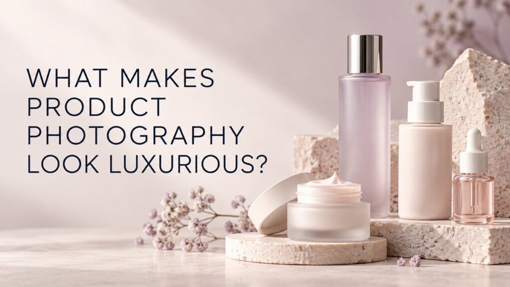
Product photography looks luxurious when every visible choice feels intentional: the light describes the packaging, the composition has room to breathe, the materials feel believable, the color palette is controlled, and retouching removes distractions without making the product artificial. Expensive-looking photography is not created by adding gold props or dramatic shadows to every image. It comes from clarity, restraint, craft, and alignment with the brand.
For beauty, skincare, cosmetics, wellness, and lifestyle brands, a premium visual style must still help customers understand the product. The strongest images combine atmosphere with accurate packaging, readable labels, real texture, and useful details.
What Does “Luxury” Mean in Product Photography?
Luxury is a perception of care, quality, and distinction. In photography, that perception is built through consistency and deliberate visual decisions. Soft tonal gradients may communicate quiet sophistication. Hard directional light may feel architectural and bold. Rich color can feel expressive, while a minimal neutral palette can feel calm and exclusive.
There is no universal luxury formula. A clinical skincare brand, a botanical wellness line, and a high-fashion cosmetics brand should not look identical. The visual direction should grow from the product design, audience, price position, ingredients, materials, and intended sales channels.
Does Expensive Equipment Make Product Photos Look Premium?
No camera or lens automatically creates a premium image. Equipment matters when it supports the required resolution, focus, perspective, and production workflow, but the result depends more on lighting control, product preparation, composition, styling, color management, and finishing.
A well-prepared product photographed with a thoughtful lighting plan will usually look more refined than an expensive setup used without control. Luxury is often lost through small problems: a crooked cap, dusty surface, uneven label, accidental reflection, distracting prop, weak crop, or inconsistent color across a product line.
How Does Lighting Create a Luxury Look?
Lighting gives packaging its shape and material identity. Broad soft light can create smooth gradients across frosted glass, skincare jars, and cosmetic tubes. A more focused source can carve out edges and create a crisp, sculptural feel. The important point is that the highlight pattern should look designed rather than accidental.
Use gradients to describe form
A cylindrical bottle looks dimensional when the light moves gradually from bright to dark. Flat frontal light may make it readable, but it can also remove the sense of volume. Controlled side light, diffusion, and fill cards allow the photographer to shape that transition.
Protect reflective materials
Chrome caps, metallic labels, glossy plastic, and polished glass reflect the entire set. Their reflections need to be built intentionally. Our guide to photographing shiny and reflective products explains how diffusion, flags, and reflection cards create clean edges and highlights.
Let shadows support the concept
Shadows can add depth and visual rhythm, but they should remain consistent with the imagined light source. A shadow that crosses a label or competes with the product weakens clarity. Soft shadows often feel calm and tactile; sharper shadows may feel graphic or editorial.
Why Does Composition Matter?
Premium compositions make hierarchy obvious. The viewer should know where to look first, what belongs together, and how the eye should move through the frame. This can be achieved with negative space, careful spacing, repeated shapes, leading lines, or a controlled imbalance.
Negative space is especially valuable. It prevents the set from feeling crowded and leaves room for campaign copy, website headers, or advertising layouts. It also gives a hero product greater visual importance. Learn more about the role of a hero shot in product photography.
For a group image, vary height and depth without hiding important labels. For a single product, small changes in rotation can improve the silhouette, reflection pattern, and relationship between the cap and body. The composition should still work at the crop sizes the brand plans to use.
Which Backgrounds Look Luxurious?
A luxury background does not need to be expensive. Paper, painted surfaces, acrylic, fabric, stone, glass, or a seamless sweep can all look refined when their color and texture support the product. The background should not introduce a material story the brand cannot support.
Consider these relationships:
- Tonal contrast: enough separation for the package edges and label
- Texture scale: background details should not overpower a small product
- Color harmony: colors can repeat packaging tones or create a deliberate contrast
- Surface behavior: glossy surfaces add reflections; matte surfaces keep attention on the product
- Brand relevance: clinical, botanical, playful, and fashion-led products require different settings
For a practical comparison of white, colored, textured, and contextual sets, see how to choose the best background for product photography.
Do Props Make Product Photography Look More Expensive?
Props can add scale, context, ingredient cues, or visual structure, but they do not automatically create value. A luxury image often uses fewer, better-chosen elements. Every prop should have a job.
A stone block can add height and a tactile surface. A measured amount of water can suggest freshness or product behavior. A botanical element may support a real ingredient story. Fabric can introduce softness or movement. If a prop hides the product, creates an unsupported claim, or attracts more attention than the packaging, it is working against the image.
Props should also be selected for how they behave under light. Scratched acrylic, artificial-looking flowers, dusty fabric, and unstable food ingredients can create extra cleanup or make the set feel less considered.
How Important Is Product Styling?
Styling is central to premium product photography because the camera records small inconsistencies. Caps, pumps, labels, boxes, applicators, and product textures must be aligned intentionally. Multi-product arrangements should feel balanced from the camera angle, not only from above or from the side of the set.
Beauty and skincare images may also involve cream swirls, serum drops, powder, foam, gel, or water. These elements need controlled shape and freshness. The texture should look like the real formula, and the amount should support the composition without implying a use or benefit that the brand has not approved.
What Role Does Color Play?
A limited color palette often feels more cohesive because every hue has a clear purpose. That does not mean luxury must be beige or muted. Saturated colors can look highly premium when they are controlled across background, props, packaging, and shadows.
Color accuracy remains essential. A campaign image can have a creative grade, but the product’s identifying color should remain believable. Color-managed capture, calibrated review, and physical product references help prevent a pale lavender bottle from becoming gray or a warm nude package from turning orange.
How Much Retouching Should Luxury Product Photography Use?
Retouching should create polish without erasing the physical product. It can remove temporary dust, fingerprints, support tools, surface marks, and minor manufacturing distractions. It may combine carefully captured exposures to balance a label, cap, and glass body.
Over-retouching can reduce trust. Perfectly smooth plastic, impossible reflections, artificial edges, or changed packaging colors make the image feel rendered rather than photographed. Texture and material differences are part of the premium experience and should be preserved.
How Do E-Commerce and Campaign Luxury Images Differ?
A premium e-commerce image remains direct and informative. It may use a clean background, accurate front view, consistent scale, and controlled shadow. A campaign image can be more expressive through color, composition, surface, and light. Both should share the same product accuracy and finishing standards.
A useful content library normally combines several image types:
- Clean product-page images for comparison and purchase decisions
- Detail shots of materials, closures, textures, and applicators
- Styled hero images for launches and collection pages
- Vertical and horizontal campaign crops
- Lifestyle or in-use imagery when context helps explain the product
E-commerce photography and styled studio product photography serve different functions, but they can be planned together so the brand feels consistent across channels.
How Can a Smaller Brand Create a Premium Visual Direction?
Start by prioritizing the images that do the most work. Define one clear hero concept, a practical e-commerce shot list, a controlled palette, and crops for the most important channels. Reuse surfaces or lighting ideas across related products where that supports consistency. A focused production plan is usually stronger than many unrelated concepts.
Bring packaging samples, brand colors, approved claims, reference images, and channel requirements into the planning process. References should describe a direction rather than invite direct copying. The goal is a visual system that belongs to the brand.
Frequently Asked Questions
Do luxury product photos need dark backgrounds?
No. Light, neutral, colorful, or dark backgrounds can all feel luxurious. Lighting, separation, color harmony, and brand fit matter more than brightness alone.
Does adding gold make a photo look premium?
Only when gold genuinely fits the packaging and brand direction. Decorative gold added without context can feel generic and may compete with the product.
Should luxury photos use shallow depth of field?
Selective focus can create atmosphere, but essential product features and labels should remain clear. Many hero images combine controlled depth with focus stacking when needed.
Can product photography look premium on a white background?
Yes. Clean edges, accurate color, subtle shadows, consistent scale, and careful retouching can make a white-background image feel highly refined.
Create a Premium Look That Still Explains the Product
Luxury product photography is the result of intentional decisions rather than a single effect. If you need refined imagery for a beauty, skincare, cosmetics, wellness, or lifestyle brand, contact Picture Your Products to discuss a shot list and visual direction for your product page or campaign.