
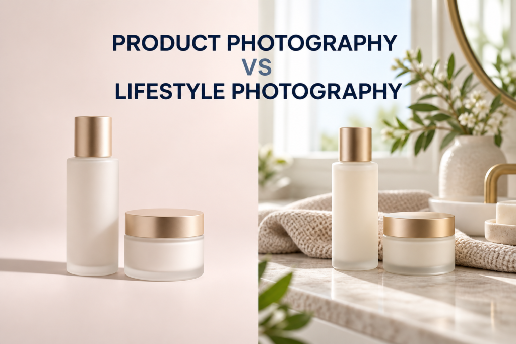
Product photography shows an item clearly; lifestyle photography shows that item in a believable context. Most e-commerce brands need both. Clean product images help shoppers inspect packaging, shape, color, and features, while lifestyle images help them imagine how the product fits into a routine, environment, or identity.
The right mix depends on where the images will appear and what the shopper needs to understand at that stage. A product page may begin with a clean hero image, move through angles and details, and then use lifestyle scenes to explain scale, use, or mood. A launch campaign may reverse that emphasis and lead with a more emotional setting.
What is product photography?
Product photography is imagery in which the product is the primary subject and visual information is carefully controlled. The background may be white, neutral, colored, or designed, but the item remains easy to identify and evaluate.
For e-commerce, product photography often includes a front view, alternate angles, packaging, important label details, texture, and a group or collection image. Consistent lighting and framing make it easier to compare products across a store. Explore the role of clean catalog-ready imagery in e-commerce product photography.
What does a standard product image communicate?
- The product’s shape, proportions, color, and finish
- Package design and readable label information
- Included parts, applicators, closures, or accessories
- Texture and material details that influence expectations
- Visual consistency across variants or a complete collection
A product photograph does not have to be plain. A styled studio image can use color, surfaces, ingredients, or graphic shadows while still keeping the item unmistakably central. The key is that styling supports product comprehension instead of competing with it.
What is lifestyle product photography?
Lifestyle product photography places the item in a setting that suggests how, where, or by whom it may be used. The scene can be literal, such as a cleanser near a bathroom sink, or more interpretive, such as a serum surrounded by translucent surfaces and reflected light that communicate hydration.
The purpose is context. Lifestyle images connect product features with a routine, occasion, mood, or aspiration. They are especially useful when a product’s scale, application, audience, or emotional positioning is difficult to understand from a product-only image.
Does lifestyle photography need a model?
No. A lifestyle image may include hands, a model, or an environmental scene, but it can also communicate use through objects and composition alone. An open jar beside a folded towel can suggest a skincare ritual. A wellness product on a bedside table can suggest a daily routine without showing a person.
Product photography vs lifestyle photography: the key differences
| Question | Product photography | Lifestyle photography |
|---|---|---|
| Primary job | Explain the item | Explain the experience or context |
| Visual priority | Clarity and consistency | Story, use, and atmosphere |
| Typical setting | Controlled studio set | Designed environment or real-world scene |
| Common placements | Product pages, catalogs, marketplaces | Campaigns, social media, landing pages |
These are useful distinctions, not rigid categories. A carefully styled image can be both descriptive and atmospheric. The best classification is based on the image’s job, not simply whether it was made in a studio.
Which images belong on an e-commerce product page?
A strong product page usually leads with clarity and adds context in a deliberate sequence. The first image should make the item easy to recognize. Supporting images can then answer questions about alternate views, packaging, texture, size, application, and use.
- Primary product image: a clear view that establishes exactly what is being sold.
- Angles and packaging: side, back, open, closed, or boxed views when they add information.
- Detail or texture image: a close view of a finish, applicator, label, material, cream, gel, or serum.
- Scale or application image: a hand, familiar object, or environmental reference that makes size or use easier to understand.
- Lifestyle image: a scene that connects the product to a routine and brand world.
The precise number should follow the product’s complexity rather than a fixed formula. The guide to how many images a product page should have explains how to decide based on buyer questions.
How do beauty and skincare brands use both styles?
Beauty and skincare products often need both technical clarity and sensory communication. A clean front view shows the bottle, carton, and labeling. A close texture image helps distinguish a light serum from a dense cream. A lifestyle scene can then suggest when the product is used and how it belongs within a routine.
Example: launching a facial serum
A useful image set might include the bottle alone, bottle with carton, side and back views, dropper detail, serum texture, a styled hero image, and a bathroom or vanity scene. Each image answers a different question. Repeating the same front view against several backgrounds adds variety, but it may not add information.
Example: photographing a wellness collection
Individual product images make the range easy to shop. A group image explains the collection. Lifestyle scenes can organize the products by morning, evening, travel, or another genuine use case. The sequence moves from identification to understanding and then to aspiration.
When should a brand prioritize product photography?
Prioritize product-focused images when shoppers must inspect the item before buying, when a marketplace has strict primary-image rules, or when a store needs consistent thumbnails across many SKUs. They are also essential when packaging accuracy, color, components, or variants are central to the decision.
A controlled studio product photography setup can preserve a consistent visual system while still allowing creative supporting images.
When should a brand prioritize lifestyle photography?
Give lifestyle imagery more space when context is necessary to explain scale, use, audience, or positioning. It is also useful for campaign pages, social content, email, and paid creative where the first task is to earn attention and communicate a feeling quickly.
However, atmosphere should not obscure the product. If a shopper cannot tell what is being sold, cannot see the package clearly, or mistakes a prop for part of the offer, the scene is not doing enough commercial work.
Can product and lifestyle images be made during one shoot?
Often, yes, if both sets are planned before production. Products can first be photographed in repeatable catalog setups and then moved into styled scenes. Planning the backgrounds, props, crops, product preparation, and final channels in advance reduces unnecessary resets and reveals which images can share lighting or set elements.
Start with a channel-based product photography shot list. Label every requested image by purpose: primary product page, detail, collection, banner, social crop, ad, or editorial feature. This is more useful than asking for an undefined mix of “clean” and “lifestyle” images.
How should you choose the right mix?
Work backward from customer questions and placements. If the first image already explains shape and packaging, the next image should contribute something new. For every planned photograph, ask:
- What does this image help the shopper understand?
- Where will it appear?
- Does the crop work in that placement?
- Is the product still the visual priority?
- Does another planned image already do the same job?
A small, purposeful set can be more useful than a large gallery of near-duplicates. Product images build confidence through clarity; lifestyle images build relevance through context. Together they create a more complete buying experience.
Common planning mistakes
- Making every image purely functional: the page explains the product but never communicates the brand’s point of view.
- Making every image atmospheric: shoppers see a mood but cannot inspect what they are buying.
- Ignoring crop requirements: a successful wide scene may fail when forced into a square product card or vertical social placement.
- Using props without a reason: decoration adds visual noise or creates confusion about ingredients and included items.
- Skipping continuity: changing color, scale, or packaging presentation from image to image weakens trust.
Frequently asked questions
Is white-background photography the same as product photography?
White-background photography is one type of product photography. Product-focused images can also use neutral colors, brand colors, gradients, reflective surfaces, or carefully designed sets.
Are lifestyle photos suitable for a primary product image?
It depends on the sales channel. A brand-owned website may allow a styled primary image, while marketplaces can impose their own current rules. Even when allowed, the product should remain easy to identify.
Which style is better for social media?
Lifestyle and styled studio images often provide more narrative variety for social media, but clean product images remain useful for launches, educational posts, comparisons, and retargeting creative.
Do service businesses need both image types for every product?
Not necessarily. Prioritize the images that answer real buyer questions and support planned placements. Simpler products may need fewer explanatory views; unfamiliar or sensory products may need more context.
Plan a useful image mix
Picture Your Products creates product-focused and lifestyle imagery for beauty, skincare, wellness, and lifestyle brands in Chicago and through remote product-shipping projects. To plan a set around your store, launch, or campaign, contact Picture Your Products.