
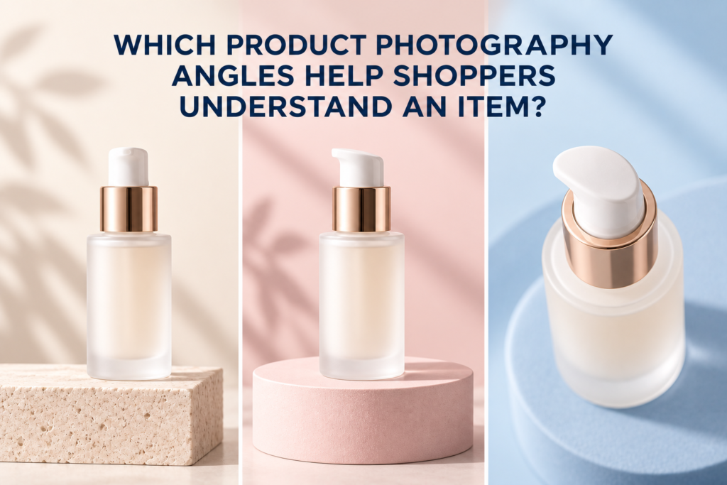
The most useful product photography angles are the ones that answer a shopper’s questions: a straight-on view for identity, a three-quarter view for depth, side and back views for construction or information, an overhead view for layout, and close detail views for important features. Not every product needs every angle. The right set depends on shape, packaging, moving parts, scale, and what the customer cannot inspect online.
Changing the camera position only to create variety can fill a gallery without adding information. A better approach is to give every angle a specific purpose. The result is a smaller, clearer image library that supports product pages, retailer listings, launches, ads, and social content.
Which Product Photography Angles Help Shoppers Most?
For many products, begin with a straight front view and a three-quarter view. Add back, side, top, bottom, open, in-use, and detail angles only when they reveal something relevant. A shopper should be able to understand the item’s form, contents, size, interface, finish, and method of use without guessing.
A practical core sequence is:
- Front view
- Three-quarter view
- Back or information panel
- Side view when depth or construction matters
- Top or overhead view when the opening, cap, kit, or layout matters
- Close detail of the most important feature
- Scale or in-use image when dimensions are hard to imagine
What Does a Straight-On Front View Show?
A front view identifies the product quickly. It usually displays the main label, silhouette, and primary packaging design with minimal perspective distortion. This makes it a strong choice for product grids and the opening frame of an e-commerce photography gallery.
The product should be level and oriented consistently across related SKUs. Matching camera height, crop, and scale helps collection pages feel organized. A front view is less useful when it hides depth, a side mechanism, or important included components, so it should not be the only image by default.
Why Is the Three-Quarter Angle So Common?
A three-quarter angle shows the front and one side at the same time. It gives the shopper a clearer sense of volume while keeping the main label recognizable. Bottles, jars, boxes, electronics, and home goods often benefit from this view.
The angle does not need to be exactly the same for every object. A shallow turn may be enough to define a rectangular carton, while a round jar may need lighting and shadow rather than rotation to reveal form. The camera should remain at a height that supports the intended message: neutral for commerce, lower for a more dramatic hero image, or higher when the top matters.
When Do Side and Back Views Matter?
Use side and back views when those surfaces contain information or construction details that affect the purchase. A side view can show thickness, profile, handles, seams, ports, closures, or layered components. A back view can show directions, an ingredient panel, controls, or how packaging opens.
Do not add a side view simply because it is different. If a cylindrical bottle looks nearly identical from every rotation, a redundant side photograph may add little value. A close view of the pump, dropper, or texture may be more useful.
What Is an Overhead Product Photo Best For?
An overhead or top-down image is useful for flat lays, kits, bundles, open containers, palettes, and groups of items. It can explain what is included and how components relate to one another. It also adapts well to square and vertical compositions when spacing is planned in advance.
Overhead views can make tall products look flatter, so they should be paired with an angle that communicates height. For a skincare set, an overhead arrangement may show the complete routine, while a front or three-quarter view explains the individual packages.
When Should You Use a Low or High Camera Angle?
A low angle can give a product more presence and is often used for a hero shot. It can emphasize height, architecture, and a premium campaign mood. The tradeoff is that labels, tops, and included parts may become harder to see.
A high angle reveals top surfaces, openings, applicators, and the relationship between grouped objects. It may be useful for an open cosmetic compact, candle vessel, supplement jar, or boxed set. Neither angle is automatically better; each should be chosen for the information or feeling it adds.
What Detail Angles Do Beauty and Skincare Products Need?
Beauty and skincare galleries often need packaging, applicator, and texture views in addition to standard angles. Useful options include:
- The bottle or jar with its carton
- The closure removed
- A dropper, pump, wand, spatula, or nozzle close-up
- A measured drop, cream scoop, smear, powder, or gloss detail
- A macro view of a reflective, embossed, or translucent finish
- A hand or familiar object that communicates scale
- A use-context image that shows where the product fits into a routine
Texture color and viscosity should remain believable. Lighting that works for the package may not be ideal for a serum drop or cream swipe, so the texture can require its own setup.
How Do You Choose Angles for Reflective or Transparent Packaging?
Reflective and transparent products need angles that preserve shape without turning the packaging into a mirror of the room. Rotation changes which surfaces catch the light and where dark or bright reflections appear. The most descriptive angle may require separate flags, diffusion, backlighting, or a controlled gradient.
Test the label, edges, cap, liquid level, and internal components at the intended camera position. A glass bottle that looks clean from the front may reveal distracting reflections at three-quarter view. The solution is to design the lighting for that view, not to avoid useful information.
Should Every Product Use the Same Angles?
Related products should follow a consistent visual system, but consistency does not mean identical shot counts. A simple carton may need front, back, and three-quarter images. A cosmetic kit may need a group view, individual items, open and closed positions, applicators, shades, and texture details.
Build a required core that repeats across the catalog, then add product-specific views. This keeps the store coherent while giving complex items enough explanation. The article on how many images a product page should have explains why the total should follow shopper questions rather than a fixed number.
How Should Angles Be Planned for Mobile Screens?
Review every planned view at thumbnail and phone size. A wide scene with a small product may look elegant on a large monitor but fail inside a mobile gallery. Labels, applicators, and texture details often need tighter dedicated frames rather than aggressive crops from one master image.
Plan square, portrait, and horizontal uses before production. Leave enough space around the product for responsive layouts, but keep it large enough to inspect. If advertising copy will be added, note where safe negative space belongs.
A Product-Angle Shot-List Method
Start by listing what a customer would examine in person. Then match each question to the simplest view that answers it.
- What is it? Front view
- What shape and depth does it have? Three-quarter or side view
- What information is on the package? Back or panel detail
- What is included? Group or overhead view
- How does it open or dispense? Open position and applicator detail
- What does the material or formula look like? Macro and texture view
- How large is it? Scale or in-use image
Record these decisions in a complete product photography shot list, including orientation, crop, background, props, variations, and final channel. This helps avoid discovering after production that a crucial surface or feature is missing.
Frequently Asked Questions
Is a 45-degree angle always the best product angle?
No. A three-quarter view is versatile, but the best angle is the one that explains the product. Some objects need a straighter, higher, lower, or more detailed view.
How many angles should one product have?
Use enough angles to show identity, form, important information, included components, and use. Simple products may need only a few; complex products need more.
Should the first product image be front-facing?
Often yes, especially in a consistent store grid. A channel’s current rules and the product’s shape should guide the final choice.
Can one photograph be cropped into several angles?
No. Cropping changes framing, not camera perspective. Multiple aspect ratios may come from one setup, but a true side, overhead, or detail view requires a separate capture.
If your catalog needs a clear, efficient angle plan, contact Picture Your Products to discuss product photography, video, and the channels the content must support.