
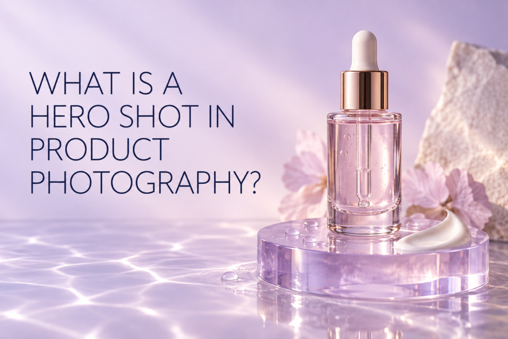
A hero shot in product photography is the lead image designed to make a product immediately desirable and recognizable. Unlike a catalog image that mainly documents shape and packaging, a hero shot combines composition, lighting, styling, color, and space to express the product’s most important idea. Brands use hero images on homepages, launch pages, advertising, retail displays, email headers, and social campaigns.
A strong hero photograph is still truthful. It should preserve the product’s proportions, packaging color, label, finish, and important details while giving the image a clear visual hierarchy. The product remains the subject; props, surfaces, texture, and effects support the story rather than compete with it.
What Is a Hero Shot in Product Photography?
A hero shot is a carefully art-directed product image created to carry a prominent marketing placement. It usually has one clear focal point, a deliberate mood, and enough visual impact to work at large scale. It may show one item, a product family, packaging with texture, or a product in a stylized environment.
The term describes the image’s job, not one fixed style. A hero shot can be minimal and bright, dark and dramatic, colorful and graphic, or natural and tactile. What makes it a hero image is that it communicates the central product or campaign message quickly.
How Is a Hero Shot Different From a Standard Product Photo?
A standard product photo is primarily informational. It shows what the item looks like, often against white or another consistent neutral. A hero shot is more interpretive: it decides what the viewer should notice first and what feeling should accompany that information.
- Catalog image: clear comparison, consistent scale, accurate packaging, simple background.
- Hero image: campaign idea, visual hierarchy, purposeful styling, placement-specific composition.
- Detail image: close inspection of a feature, material, applicator, texture, or finish.
- Lifestyle image: context, use, environment, scale, or human interaction.
These images are complementary. A product page may open with a clean commerce image and later include a hero photograph for brand value, while a homepage may lead with the hero and link to a gallery of factual views.
What Should a Product Hero Shot Communicate?
The image should communicate one main idea before it adds supporting details. For a serum, that idea might be lightweight hydration, precision application, or a refined clinical character. For a lipstick, it might be shade, finish, or confident color. For a wellness product, it could be routine, portability, or calm.
Trying to communicate every benefit in one frame weakens the hierarchy. Choose a lead message, then decide which visual elements can express it without adding unsupported claims. Water may suggest freshness, but it should not imply a formula property the brand has not established. Ingredients should be shown only when their relationship to the product is accurate.
Where Are Hero Images Used?
Hero shots are most useful where a viewer makes a quick first impression:
- Homepage and landing-page banners
- Product or collection launch pages
- Paid social and display advertising
- Email campaign headers
- Retailer features and digital shelf banners
- Press kits and sales presentations
- Organic social announcements
The same scene may not fit every placement. A wide desktop banner needs horizontal breathing room, while a story or reel cover needs a vertical crop. Planning multiple compositions during studio product photography is more reliable than forcing one finished image into every ratio.
What Makes a Strong Hero Composition?
A strong composition makes the product identifiable at thumbnail size and interesting at full size. The eye should know where to enter the frame. Product position, camera height, shadow direction, prop placement, and negative space should work together.
One clear focal point
Even when several items appear, one product or group should dominate. Repetition can create rhythm, but equal visual weight across too many objects can make the image feel like a collection grid instead of a campaign.
Useful negative space
Negative space gives the layout room for a headline, button, crop, or responsive website treatment. The space should be intentional and photographically complete, not an empty area added after the fact.
Depth that supports the product
Foreground and background layers can add dimension. They should not cover labels or create confusing overlaps. A pedestal, shadow, reflected surface, or subtle out-of-focus element can establish depth without stealing attention.
How Do Lighting and Reflections Affect the Hero Shot?
Lighting defines the package material and the emotional tone. Soft broad light can feel clean and approachable. Narrow highlights and deeper shadows can create a more sculptural result. Transparent glass may need backlight or edge control, while chrome caps need carefully shaped reflections.
Reflection is part of the design for glossy beauty packaging. Random studio reflections can make a bottle look uneven; controlled bright and dark shapes reveal its form. The product’s real color and finish should remain believable after retouching.
Should a Hero Shot Include Props?
Props are useful when they clarify an idea, scale, use, or visual system. They are unnecessary when they exist only to fill space. A good prop has a defined role: supporting an ingredient story, creating a level change, introducing a texture, or guiding the eye toward the product.
For beauty and skincare work, formula textures often act as stronger supporting elements than unrelated decoration. A measured cream swipe, serum drop, powder scatter, or gloss mark can connect packaging with the product experience. The texture needs its own lighting and careful preparation.
How Should Beauty and Skincare Brands Plan a Hero Image?
Begin with the final placement and the product truth. Identify the campaign message, required formats, package condition, formula textures, and any claims or ingredients that must be avoided. Then create a visual direction that specifies color, surface, lighting, shadow, and crop.
A practical hero-shot brief includes:
- Primary placement and dimensions
- Lead product or product group
- Single communication goal
- Required label orientation
- Background and surface direction
- Approved props or formula textures
- Horizontal, square, and vertical crop needs
- Space required for copy or interface elements
- Retouching boundaries and color references
Add the image to the product photography shot list as a separate deliverable. A hero setup usually requires more art direction than a routine catalog view.
Can One Hero Shot Work Across Every Channel?
Sometimes one setup can produce several useful compositions, but one crop rarely serves every channel equally well. A desktop banner may place the product to one side, while a mobile layout needs a tighter centered composition. Social ads may require safe areas that differ from a website header.
Plan the family of outputs before the camera is locked. Capture alternate spacing and camera positions when necessary. This protects product scale and keeps text from covering important packaging.
Common Hero-Shot Mistakes
- Using too many props without a clear hierarchy
- Hiding the label or distinctive package shape
- Choosing a background that changes perceived product color
- Creating an effect that implies an unsupported ingredient or claim
- Leaving no safe space for responsive crops
- Relying on one wide image for every mobile and social format
- Over-retouching glass, texture, or reflections until the product looks artificial
Frequently Asked Questions
Does every product need a hero shot?
No. A straightforward catalog may only need clear commerce images. Hero photography becomes valuable when a brand needs a strong launch, campaign, homepage, or advertising image.
Can a white-background photo be a hero image?
Yes. Minimal styling, purposeful shadow, unusual scale, or a strong grouping can create a hero image on white. The distinction is the visual and marketing role, not the background color.
How many products should appear in a hero shot?
Use the smallest group that communicates the idea. One product creates focus; a coordinated family can explain a collection. Avoid including items that do not support the placement.
Is a hero shot the first image on a product page?
Not always. Many stores lead with a consistent product-only image for comparison and use the hero shot later in the gallery or elsewhere on the site.
If you need a hero image planned around a launch, website, or campaign, contact Picture Your Products to discuss product photography and videography for your required formats.